I designed and built an internal timesheet app for 1,000+ Sunshine Coast Council field workers as an intern.
Overview
Timesheeting was a persistent pain point — for workers submitting hours, and for managers trying to confirm everything was correct before payroll. I was brought in as a sole intern to take the product from concept to a near-complete design in 4–6 weeks and I also ended up working on the front-end build of the app.
Role
Product Designer & Front-end Developer
Timeframe
4-6 weeks for Design
4-8 weeks for Front-end
Team
Myself, Team Lead, Senior Front-end Developer/s
Tools


Problem
Workers were remembering hours and entering them later — leading to errors, incorrect job costing codes, and payroll delays. Managers had no way to see at a glance who hadn't submitted, meaning manual follow-ups every week. This wasn't just frustrating. It was costing real time and money across the organisation.
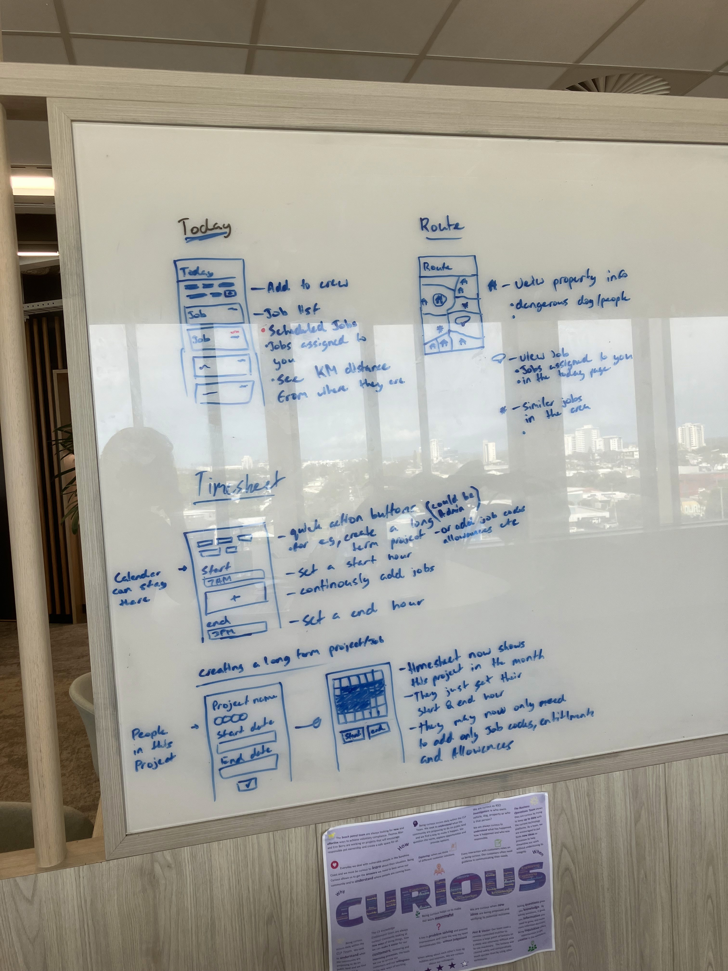
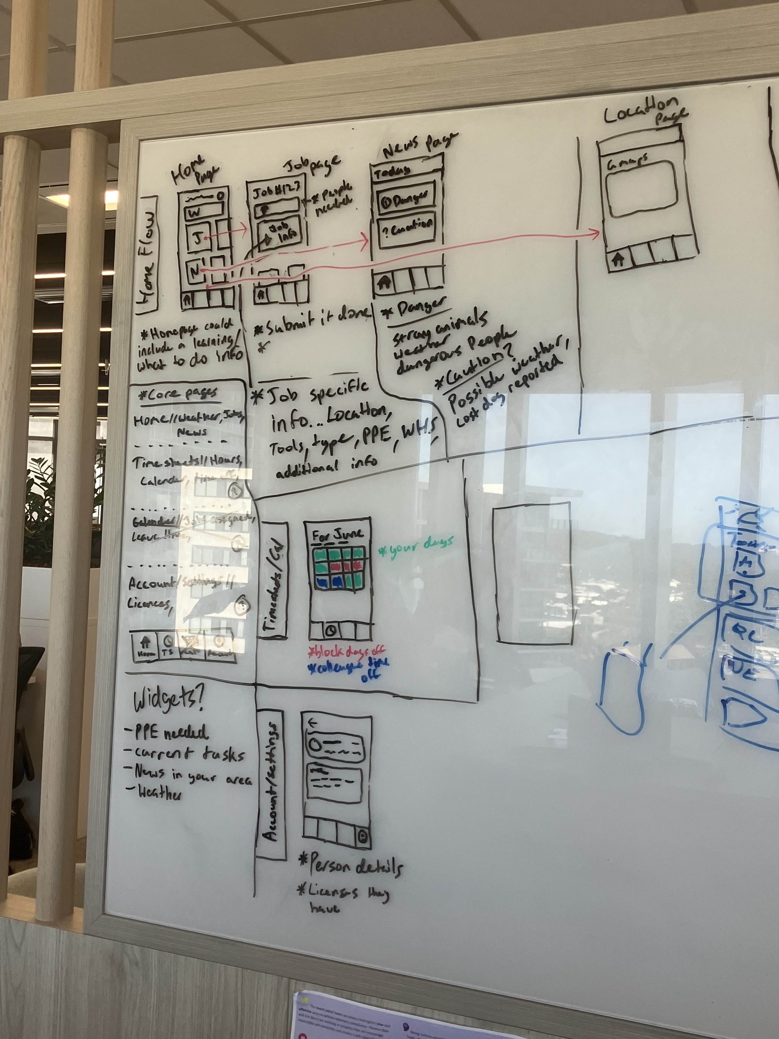
Whiteboarding Sessions
These sessions gave me enough of a foundation to move into wireframes with a clear direction — what the core screens needed to do, roughly how the navigation should work, and where the complexity actually lived.

Design System
Building this upfront meant every screen stayed consistent, and the system could be handed off cleanly to developers — and extended by future designers/developers without starting from scratch.
Color System
66 primitives
132 tokens
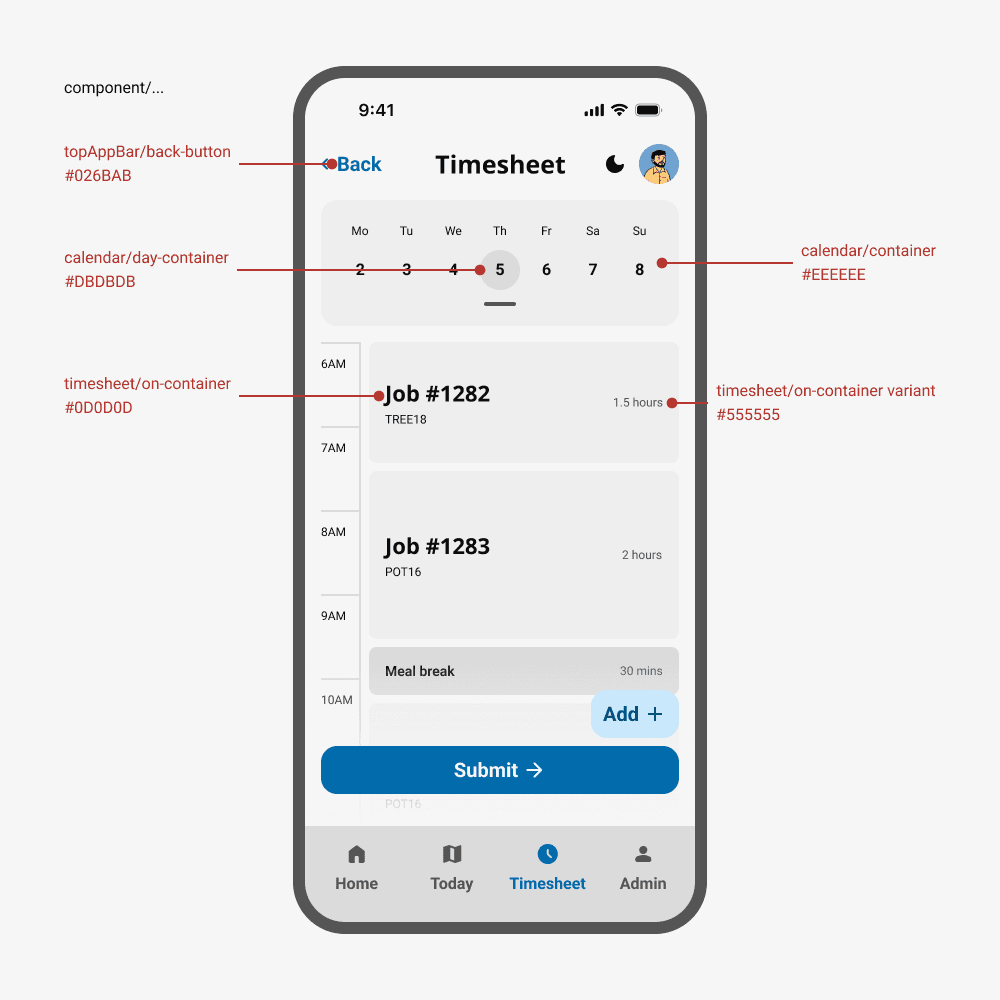
Adapted the Council's print colors into an accessible digital palette, ensuring all interactive elements met WCAG AA contrast requirements. Created semantic color tokens for success, warning, and error states.
Typography & Hierarchy
11 styles
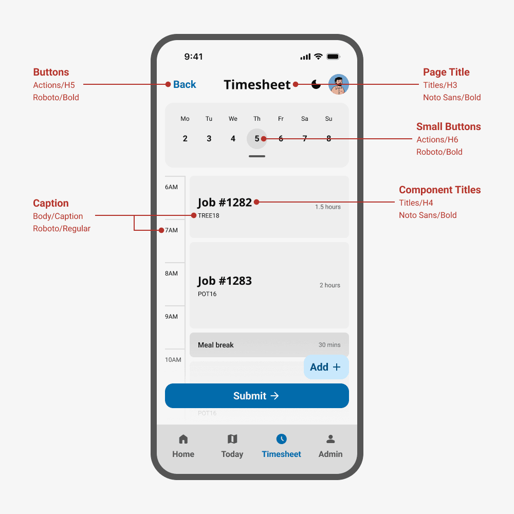
Established a type scale optimized for mobile readability with larger touch targets. Defined heading styles, body text, and UI labels that maintained brand consistency while improving legibility on small screens.
Component Library
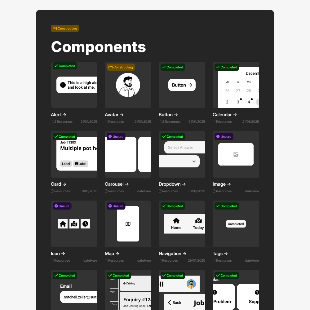
12 core components
30+ variants
Built a library of reusable components: buttons, form inputs, cards, bottom sheets, modals, and navigation elements. Each component included variants for different states (default, hover, disabled, error).
Spacing & Layout
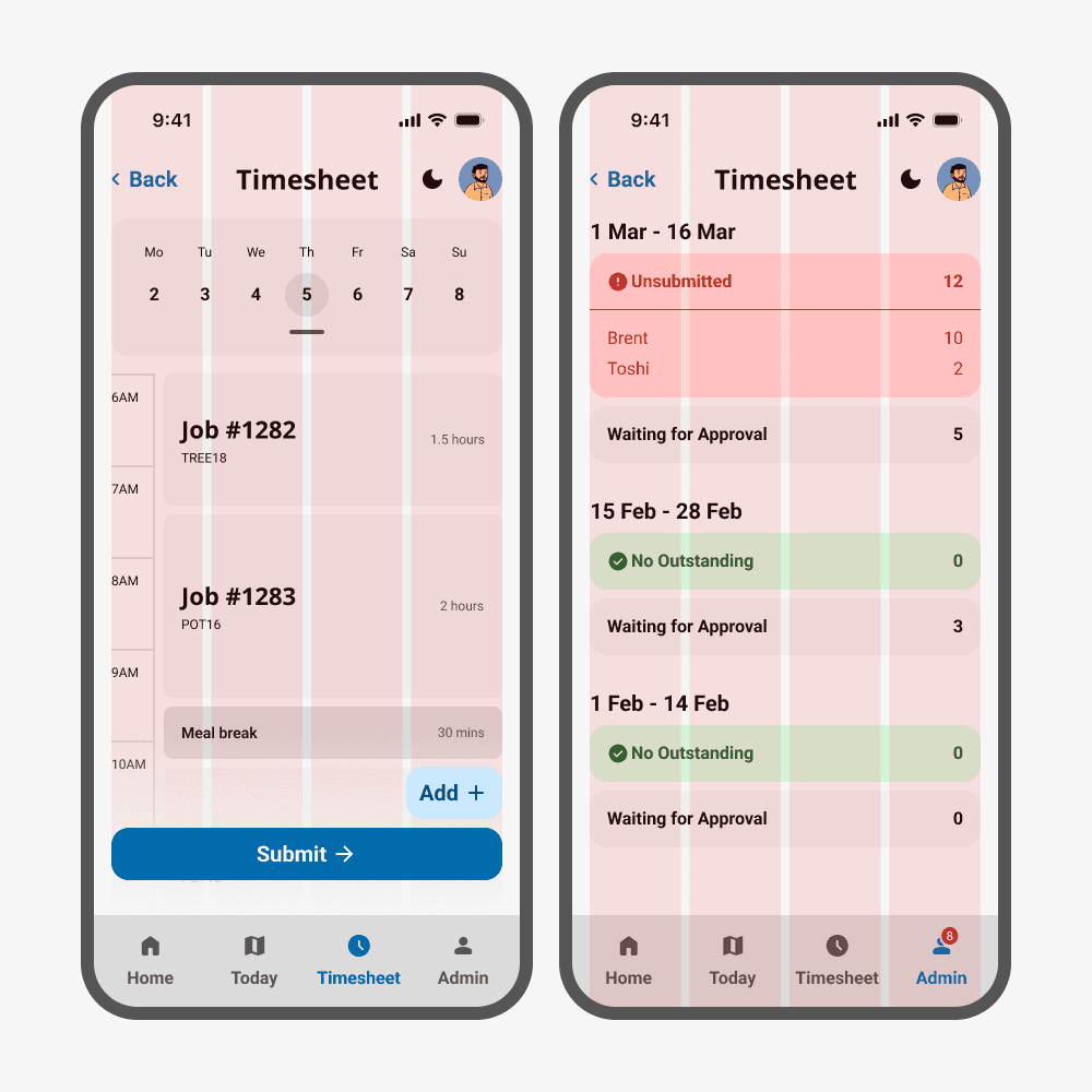
margin: 16px
gutter: 8px
Implemented an 8px grid system to create consistent rhythm across all screens and ensure components aligned properly at different breakpoints.
Informal Stakeholder Sessions
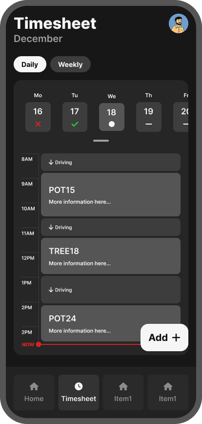
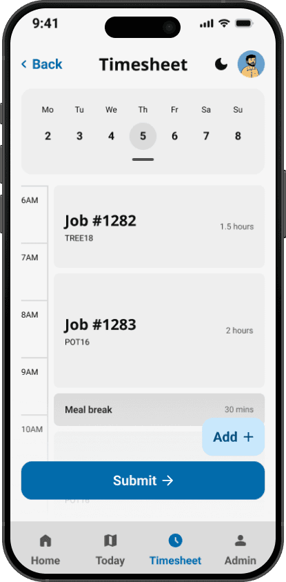
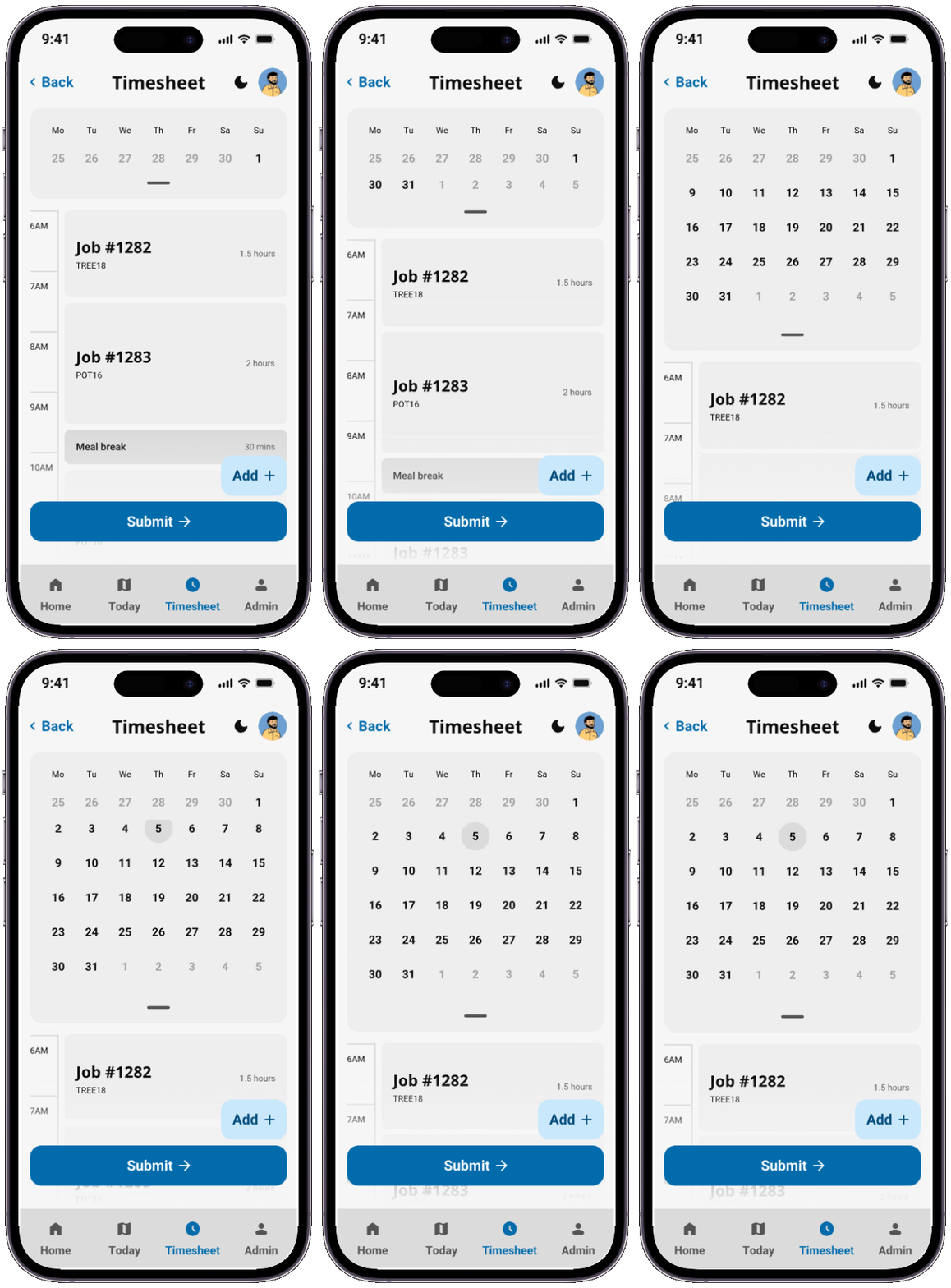
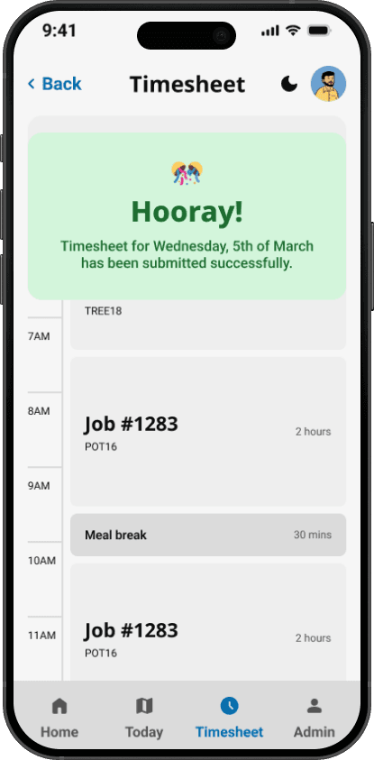
Civil Construction workers are project-based, spending full days on a single job — so a "use previous day's timesheet" template made more sense than complex navigation. Parks & Gardens crews sometimes work in groups, meaning one person needed to be able to populate timesheets for the whole team. Metal Fab workers were building their entire shift manually, entry by entry, so reducing that friction was a priority.
These weren't formal research sessions — I was mostly there to listen. But what I heard mattered. Some feedback fed directly into the core timesheet experience we were prioritising. Other feedback pointed toward features that belonged in their own space — validating concepts like the jobs section.
Timesheet Screens
Core

Manager Screens
Core


Homepage/Job Screens
Concept
Ultimately the timesheeting was a priority and these were just concepts of extra functionality and features for fieldworkers that the team lead believed should be presented to the project management/leadership.


+7 more concept screens
Outcome
The final design was presented to the CEO, Mayor, and Executive Leadership team at Sunshine Coast Council. The project was paused at the end of my internship and is scheduled for review and implementation in 2026.
The projected impact speaks for itself — hundreds of fieldworkers spending less time on admin, managers no longer chasing submissions manually, and payroll running with fewer errors and delays.
Beyond the app, the design system I built became proof-of-concept for how Council could approach digital design at scale. A foundation that could save significant time and reduce inconsistency across future projects — not just Nexus. Beyond the app, the design system I built became proof-of-concept for how Council could approach digital design at scale. With the team managing 10+ websites, one app and potentially now another app — one internal, one external — a consistent design language isn't just useful, it's overdue.